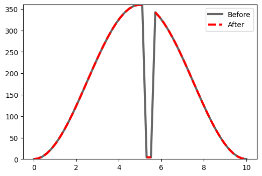
Plotting Discontinuous Data
If you have ever had to make a plot of winds where there is a jump between 270 degrees and 30 degrees, you understand that a line connecting those points looks ugly. I wrote some code to address that issue by adding in nan values whenever a threshold is met. Take a look at the following code and let me know if you have any questions. Depending on the resolution of the data, you may need to interpolate it to a fine resolution before applying this technique.
Code
#!/usr/bin/env python

import numpy as np
from matplotlib import pyplot as plt

def remove_discont(x,y):
    '''
    This function will insert nan values when there is a large disconuity in the y data

    Requires:
     inport numpy as np

    Input:
     x    : array of values on x axis
     y    : array of values on y axis

    Set:
     disc_thresh : a tunable threshhold to add nans to

    Output:
     x    : new x array with nan values inserted near discrepencies
     y   : new y array with nan values inserted near discrepencies

    Use:
     new_x, new_y = remove_discont(x,y)

    '''

    # Set disconuity threshhold
    disc_thresh = 330.

    # Calculate the position of the disconuities
    pos = np.where(np.abs(np.diff(y)) >= disc_thresh)[0]+1

    # Insert nan values
    x = np.insert(x,pos,np.nan)
    y = np.insert(y,pos,np.nan)

    return x,y

if __name__=='__main__':
    ## Test

    # Sample data
    x = np.linspace(0,10,50)
    y = 180*np.cos(np.pi*np.linspace(-1,1,50))+180.

    y[26:28]=4 # add disconuity

    # Create plot
    fig = plt.figure(figsize=(6,4))
    ax = plt.subplot(111)

    # Plot test data
    ax.plot(x,y,c='k',lw=3,alpha=.6,label='Before') # plot data

    # Get new data
    new_x, new_y = remove_discont(x,y)

    #Plot new data
    ax.plot(new_x,new_y ,c='r',lw=3,ls='dashed',label='After')

    ax.set_ylim(0,360) #set boundary

    ax.legend() #add legend

    plt.savefig('Discontinuity.png',bbox_inches='tight')
    plt.show()
The red line generated from remove_discont() is much much cleaner.

A before and after of the line plots after using the discontinuity function.
Enjoy Reading This Article?
Here are some more articles you might like to read next: